

mardi 30 août 2011
Automatic Image Montage with jQuery
Posted by YufGrafix | mardi 30 août 2011 | Category:
Jquery
|
0
comments

Arranging images in a montage like fashion can be a challenging task when considering certain constraints, like the window size when using fullscreen, the right image number to fill all the available space or also the size of the images in use. With the following script you can automatically create a montage, either for a liquid container or a fixed size container (including fullscreen), with the option to fill all the gaps.
Having a white space in the end of the container can, as well, be avoided optionally. The last image of the montage can fill the left space, so that the montage will be left gap-less.
Another option that can be useful in some cases is the possibility to only allow that the height of all images will be the height of the smallest image, avoiding that any picture gets pixelated/enlarged. (The default options will allow the enlargement of smaller images if there is a significantly higher number of larger images in the set.)
The images used in the demos are by Andrey Yakovlev & Lili Aleeva. They are licensed under the Attribution-NonCommercial 3.0 Unported License.

lundi 29 août 2011

Diapo is a jQuery plugin for creating content sliders with beautiful and custom transition effects (like curtain and mosaic).
It can display images, videos or any other HTML and can be browsed manually (with prev-next buttons or pagination links that can also display thumbnails) or the auto-slideshow functionality
he plugin is mobile-ready and has options to enable-disable features for mobile usage.
Transitions can also be customized by defining sliced rows-columns, the transition period and more.
Requirements: jQuery, jQuery Mobile, Easing & HoverIntent pluginsCompatibility: All Modern Browsers
Website: http://www.pixedelic.com/plugins/diapo/
Download: http://code.google.com/p/diapo/
MooTools has always gotten a bit of grief for not inherently using and standardizing namespaced-based JavaScript classes like the Dojo Toolkit does. Many developers create their classes as globals which is generally frowned up. I mostly disagree with that stance, but each to their own. In any event, namespaces are technically just nested objects and I recently shared with you how to create and retrieve nested objects with MooTools. With those utility functions available, I've modified Class so that you can create namespaced classes easily!
The MooTools JavaScript
The technique below is very much like monkey patching:
copy(function() {

  // Keep reference to the original Class
  var klass = Class;

  // Redefine class ("that's deep")
  Class = function(name, params, context) {
    // Find out if this is namespaced or the original method
    var namespaced = (arguments.length > 1);

    // Add the class name to the param list
    if(namespaced) params.$name = name;

    // Create and get the original class
    var original = new klass(namespaced ? params : name);

    // If namespaced, set class into namespace
    if(namespaced) Object.place(name, original, context);

    // Return this newly created class!
    return original;
  };

})();
I keep a reference to the original
Class, as I'll be using it within my newClass function. The new signature allows for a namespaced class name, the usual class properties, and the context which may be passed to the Object.place method. The first step is analyzing the arguments provided to Class; if one argument, it's a traditional class; if more than one argument is provided, we know we're trying to create a namespaced class and will act accordingly. You'll also notice that I add a $name property to the class prototype, providing the given class name to the class for later use. I've found the class' declaredClass property incredibly helpful within Dojo.
Here's how you'd use the new Class function:
copy// Create a namespaced class
var myClass = new Class("davidwalsh.ui.Slider", {
  initialize: function() {
    // Do stuff!
  },
  doSomething: function(){}
});
// myClass === davidwalsh.ui.Slider!

// Create an instance of the class
var myInstance = new davidwalsh.ui.Slider({
  // props
});

// Get the name of the declared class
var instanceClassName = myInstance.$name; // equals "davidwalsh.ui.Slider"
The first argument becomes the namespace and class name as a string. The second argument is the traditional parameters argument. If only one argument is provided to the Class function, the class is created and returned per usual; in fact, both the namespaced method and traditional method return the newly created class. The method provided above is completely backward compatible so you wont have rewrite your existing code.
Add Cue Points and Subtitles to HTML5 Video: Cuepoint JS
Posted by YufGrafix | | Category:
Jquery
|
0
comments

Do you do video tutorials or…online presentations and product (video) demos? I do and I watch a lot of video tutorials online; I love them – not all of them. I like brief, to-the-point and professionally illustrated tutorials that I can watch and understand easily. Now what makes a good online video presentation is not just crisp voice and high definition vide0 but the quality of content which includes a knowledgeable presentation with complete subtitles and cue points.
Subtitles or cue points are assistive tools that supplement the talk and allow audience of all types to understand and learn the subject – especially when your audience comes from different cultural/languages backgrounds. You do not have to explain/translate each and everything in the tutorial. Cue points can contain tips, useful information, subtitles or translation that make your online presentation easy to understand.
Adding subtitles or cue points to your videos (HTML5 videos) is quite easy. You just need Cuepoint.js, a simple open source plugin for adding cue points and subtitles to your HTML5 video.
Cuepoint binds external links to certain positions on the video timeline. It also allows you to skip to points within the video, thereby displaying specific subtitles.
Requirements: jQuery LibraryWebsite: http://cuepoint.org/
License: Free
samedi 27 août 2011

Easy, right?
Should be pretty easy right? Just absolutely position the header in the upper left (so it doesn't take up any vertical space) and then rotate it from it's upper left corner 90 degrees with CSS transforms. Yeah... that's cool, but here's the problem: a lot more browsers support absolute positioning than support transforms. That's problematic, because in the case of those browsers, the headers will now be sitting on and obfuscating content.
How I Would Do It: Feature Detection
I think the best way to handle this is to do feature detection with Modernizr. Make a quick custom build that tests for transforms, load it up at the top of the page, and then only apply the absolute positioning and transforms (and other tweaks) when you are in a browser that can deal with it.
And so...
The complete CSS:
aside {
    position: relative;
}

aside h3 {
    background: #369;
    color: #fff;
    padding: 5px 10px;
    margin: 0 0 10px 0;
}
/* Class name via Modernizr */
.csstransforms aside {
    border-left: 34px solid #369;

    /* Make a little room */
    padding-left: 10px;
}
.csstransforms aside h3 {

    /* Abs positioning makes it not take up vert space */
    position: absolute;
    top: 0;
    left: 0;

    /* Border is the new background */
    background: none;

    /* Rotate from top left corner (not default) */
    -webkit-transform-origin: 0 0;
    -moz-transform-origin:    0 0;
    -ms-transform-origin:     0 0;
    -o-transform-origin:      0 0;

    -webkit-transform: rotate(90deg);
    -moz-transform:    rotate(90deg);
    -ms-transform:     rotate(90deg);
    -o-transform:      rotate(90deg);
}
The weakness left in this technique is that if the header is longer than the space available, it doesn't push down the aside's height to compensate. There really just isn't a way to do that with just CSS (you can't set the height of something to match the width of something, basically). For the record, you could use JavaScript to do it.
Can we do it without Modernizr?
Christian et al. didn't want to use Modernizr (for reasons I can't possibly comprehend ;). Lennart Schoors, in the comments of his post, came up with this technique, where the paragraph elements themselves were also transformed (moved). By default, there is a bunch of empty space at the top of the aside, and the transform moves them back up to fill that space. Without transforms, the gap is still there, making room for the absolutely positioned header. Pretty smart!
The one shortcoming I can see is that it targets paragraph elements specifically. In a real environment you might not be able to count on that, so you are either writing a selector to cover all possible elements to move, or using an non-semantic wrapper. Also, this is subject to the same weakness as I described about header length above.
Improvements welcome!
vendredi 26 août 2011
Improved Auto-Complete For Input Fields With jQuery: Combogrid
Posted by YufGrafix | vendredi 26 août 2011 | Category:
Jquery
|
0
comments
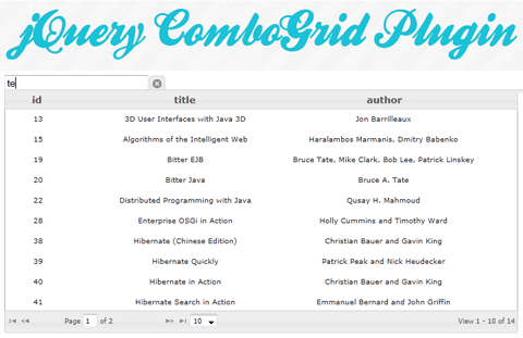
Combogrid is a jQuery plugin for adding advanced auto-completefunctionality to input fields.
As the user types, it displays the list of possible results dynamically inside a paginated grid interface.
Requests are sent via Ajax and results are returned in JSON (or JSONP for cross-domain requests) datatype.
There are many options provided like the ability to setup alternate row colors, auto-choosing the result that matches the query, minimum length of the text before the grid is activated and more.
Also, it is ThemeRoller-ready and there is keyboard support for navigating through the items.
Requirements: jQueryCompatibility: All Major Browsers
Website: http://combogrid.javaedintorni.it/
Demo: http://combogrid.javaedintorni.it/default.php
Download: http://combogrid.javaedintorni.it/download.php

Demo : http://css-tricks.com/examples/PopFromTopMessage/
We'll just make a div:
<div id="note">
    You smell good.</div>
Then we'll style it and put it on the top of the screen:
#note {
    position: absolute;
    z-index: 101;
    top: 0;
    left: 0;
    right: 0;
    background: #fde073;
    text-align: center;
    line-height: 2.5;
    overflow: hidden;
    -webkit-box-shadow: 0 0 5px black;
    -moz-box-shadow:    0 0 5px black;
    box-shadow:         0 0 5px black;
}
Let's animate it
With a keyframe animation, we can "hide" it above the browser window and bring it down for a short while:
@-webkit-keyframes slideDown {
    0%, 100% { -webkit-transform: translateY(-50px); }
    10%, 90% { -webkit-transform: translateY(0px); }
}
@-moz-keyframes slideDown {
    0%, 100% { -moz-transform: translateY(-50px); }
    10%, 90% { -moz-transform: translateY(0px); }
}
Er... let's consider other browsers quick
But let's consider browsers that don't have transforms and animations for a second. For those, we'd want to default to just showing the notification bar at all times, with the ability to dismiss it.
So we'll make a custom build of Modernizr to test for transforms and animations, load that up, then we can write CSS to test for those features and only fire off the animations if we're in a browser that supports them.
.cssanimations.csstransforms #note {
    -webkit-transform: translateY(-50px);
    -webkit-animation: slideDown 2.5s 1.0s 1 ease forwards;
    -moz-transform:    translateY(-50px);
    -moz-animation:    slideDown 2.5s 1.0s 1 ease forwards;
}
The
1.0s in there is the delay before the animation runs. Best to wait a minute to make the notification more noticeable.
Now we'll add a close button into the HTML:
<div id="note">
    You smell good. <a id="close">[close]</a>
</div>
And a tiny bit of JavaScript at the bottom of the page so that the non-supporting browsers can close the notification.
<script>
 close = document.getElementById("close");
 close.addEventListener('click', function() {
   note = document.getElementById("note");
   note.style.display = 'none';
 }, false);
</script>
Look ma, no libraries.
Since we don't need that close button in browsers that do support the animations, we'll hide it:
.cssanimations.csstransforms #close {
  display: none;
}
For the record, this should work OK on mobile browsers (tested Mobile Safari). There is no fixed positioning used here, only absolute, and that's going to be less of a problem moving forward anyway (might want to consider making it fixed so even if the user is scrolled down the page they'll get it).
Inscription à :
Articles (Atom)